


A selection of recent library acquisitions curated by the Serralves’s artist's book consultant Christophe Boutin.
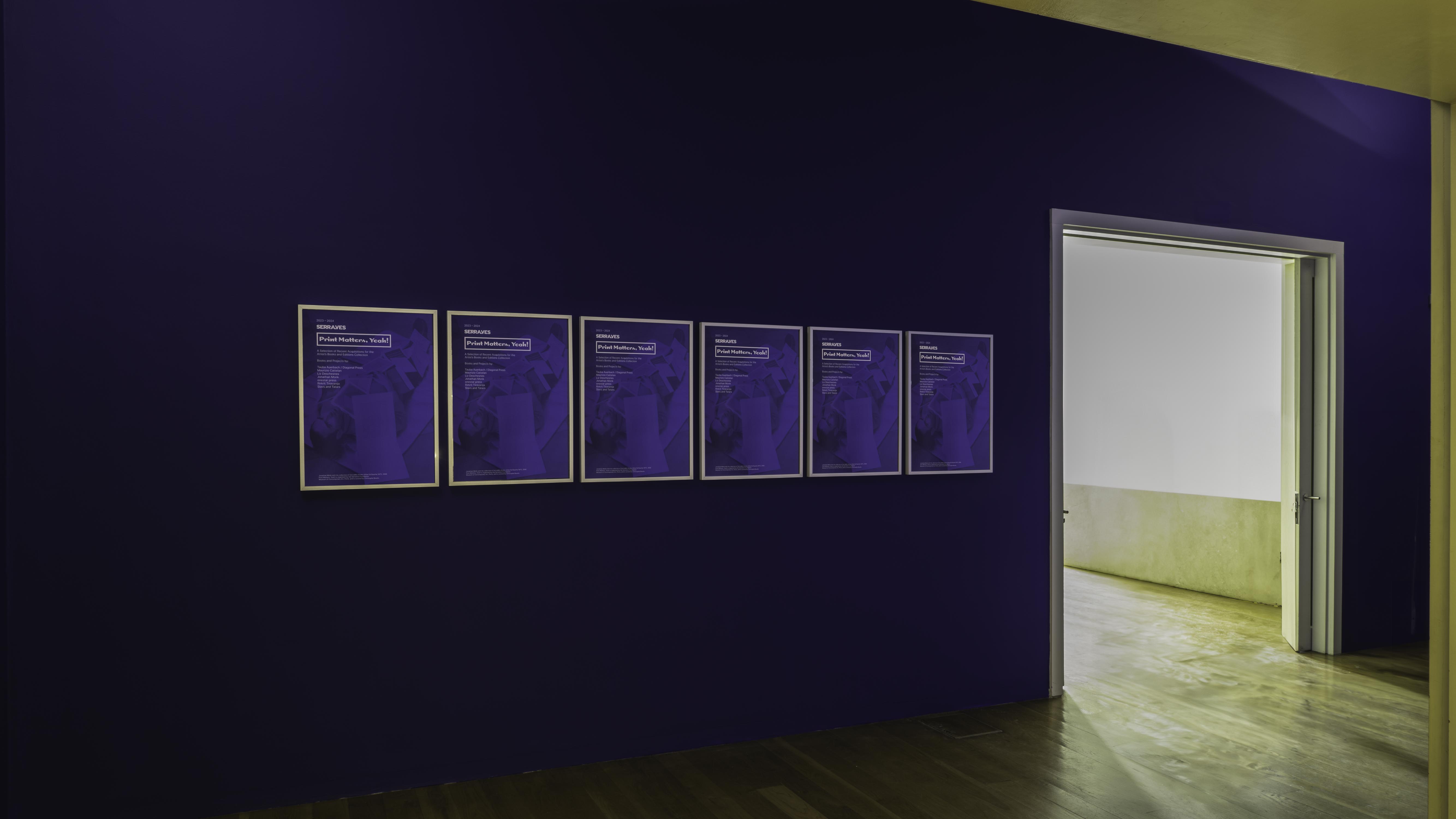
Even as digital media gained an increasing popularity in recent years, print still holds significance for many artists. It's within this perspective that the Serralves Library is presenting works by Tauba Auerbach, Liz Deschenes, Maurizio Cattelan, Jonathan Monk, Rirkrit Tiravanija and Slavs and Tatars. The exhibition additionally features a curated selection of books by the French publisher onestar press, highlighting the value of print as an important medium for many artists as they explore and expand their practices.
The variety of forms on view within the books, ephemera, and posters by the artists presented at Print Matters, Yeah! reflect the diversity of our contemporary art world. No art movement dominates, as the featured artists stand out as strong individuals, each forging their own distinct path asserting themselves as unique entities with diverse styles. Nevertheless, they all maintain a connection to the artists of the past, often referencing and drawing inspiration from the heritage of art history.
The title of the exhibition Print Matters, Yeah! plays on the name of PRINTED MATTER, Inc., as a tribute to the famous New York bookstore specializing in artist’s books. Founded in 1976 by Sol Lewitt and Lucy Lippard with a group of artists and critics who felt the need for a dedicated bookstore to distribute their publications, Printed Matter has since served as a dedicated platform for the distribution, exhibition, and appreciation of publications created by artists.
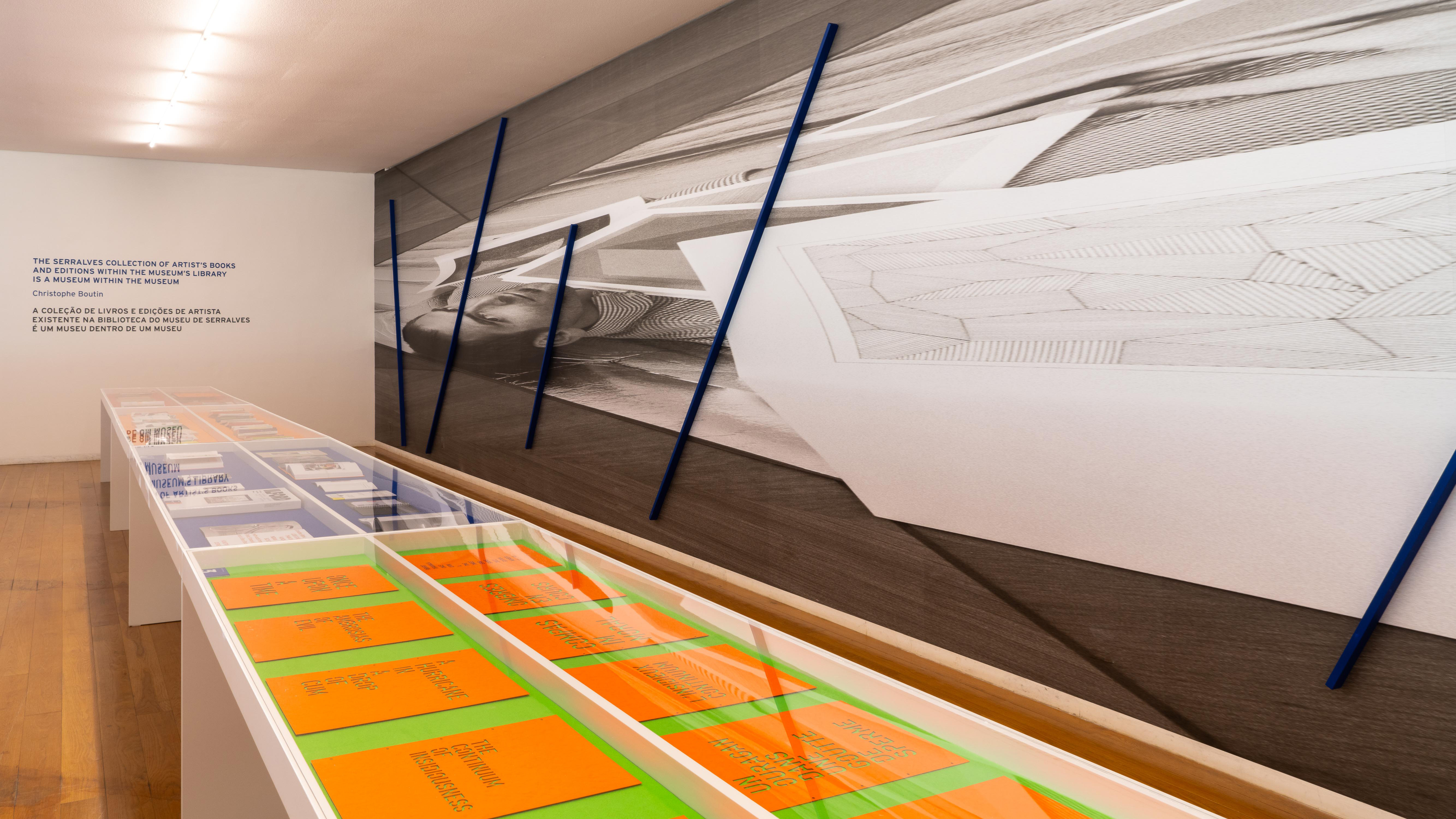
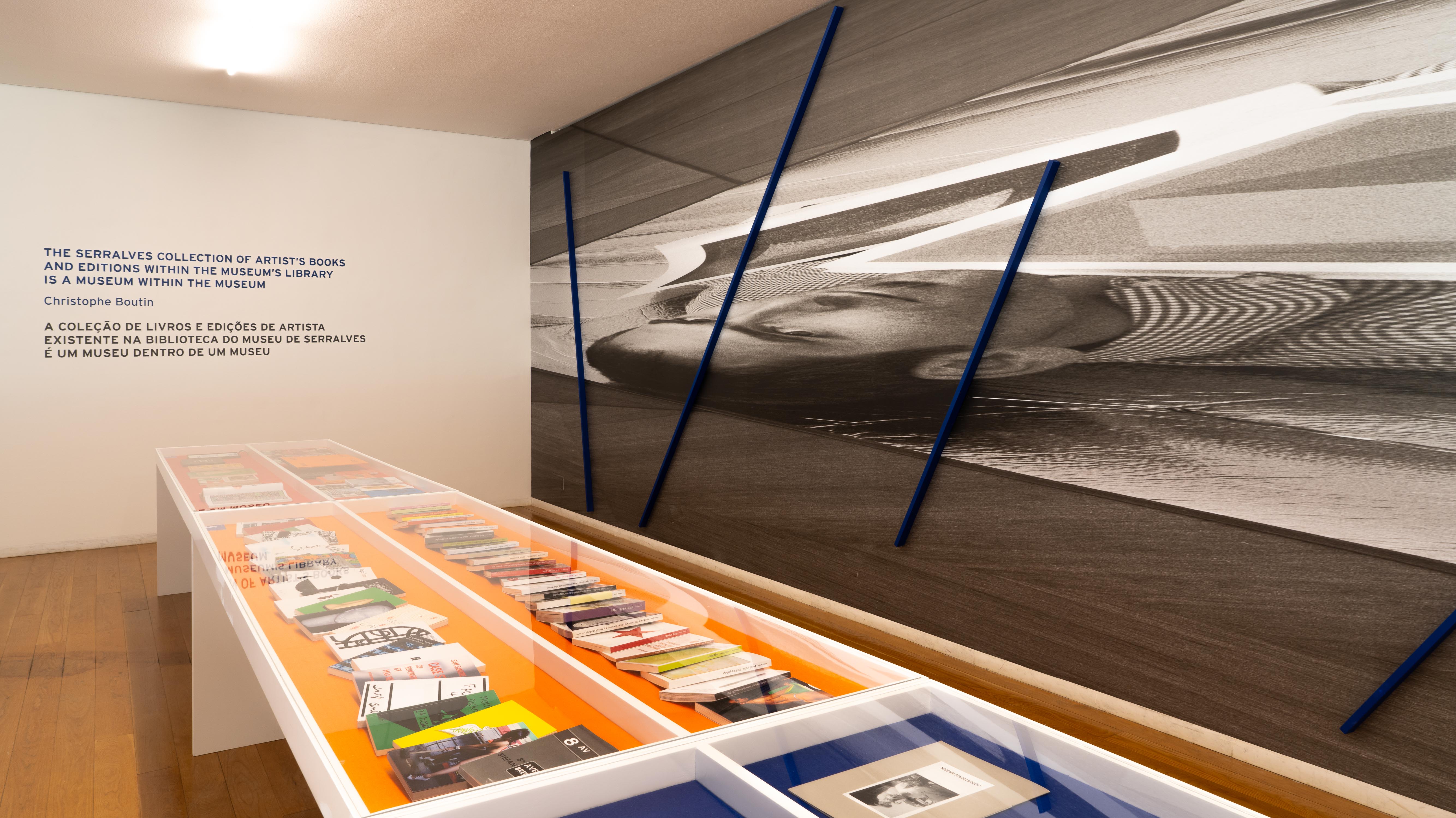
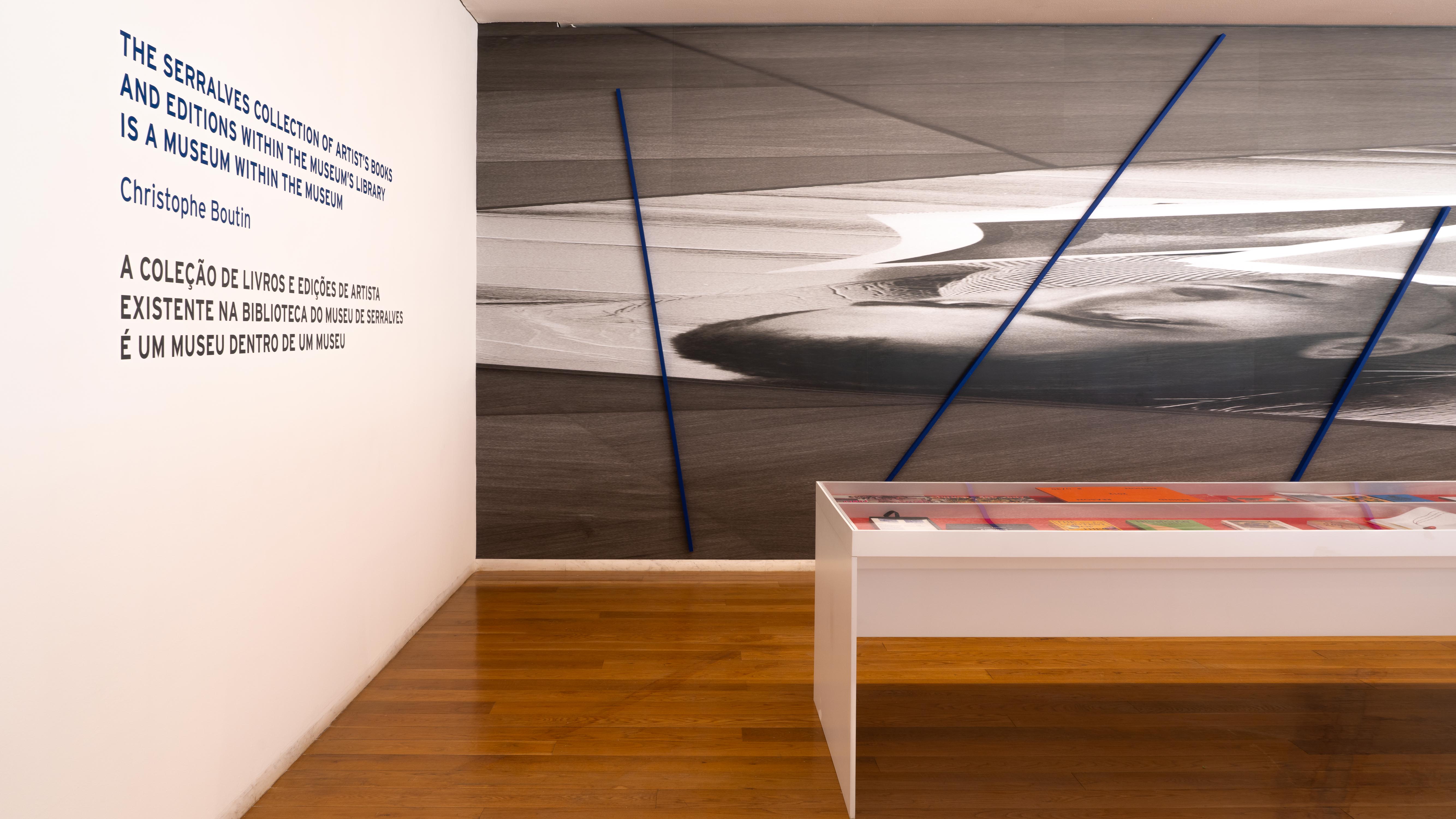
Installation
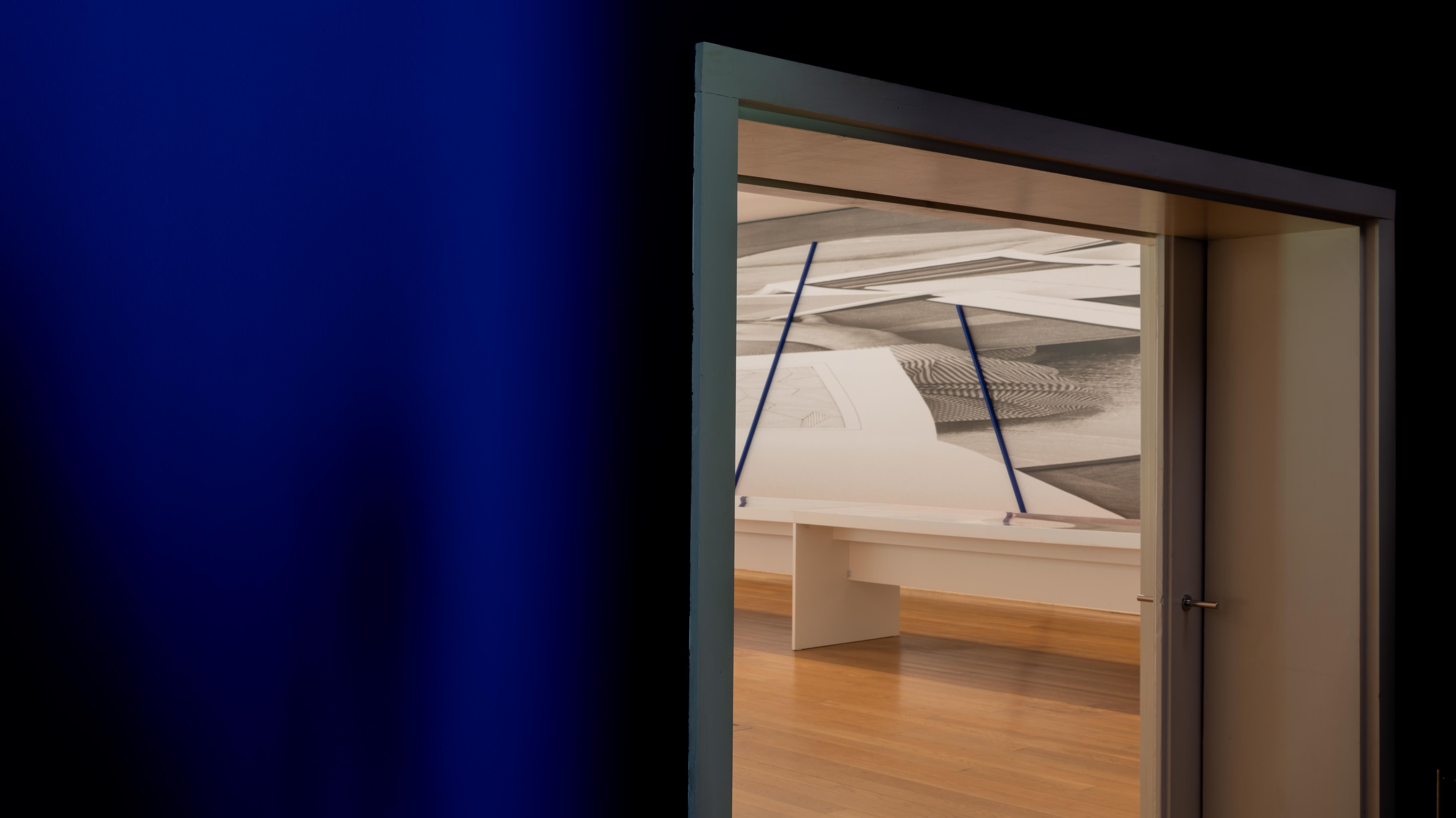
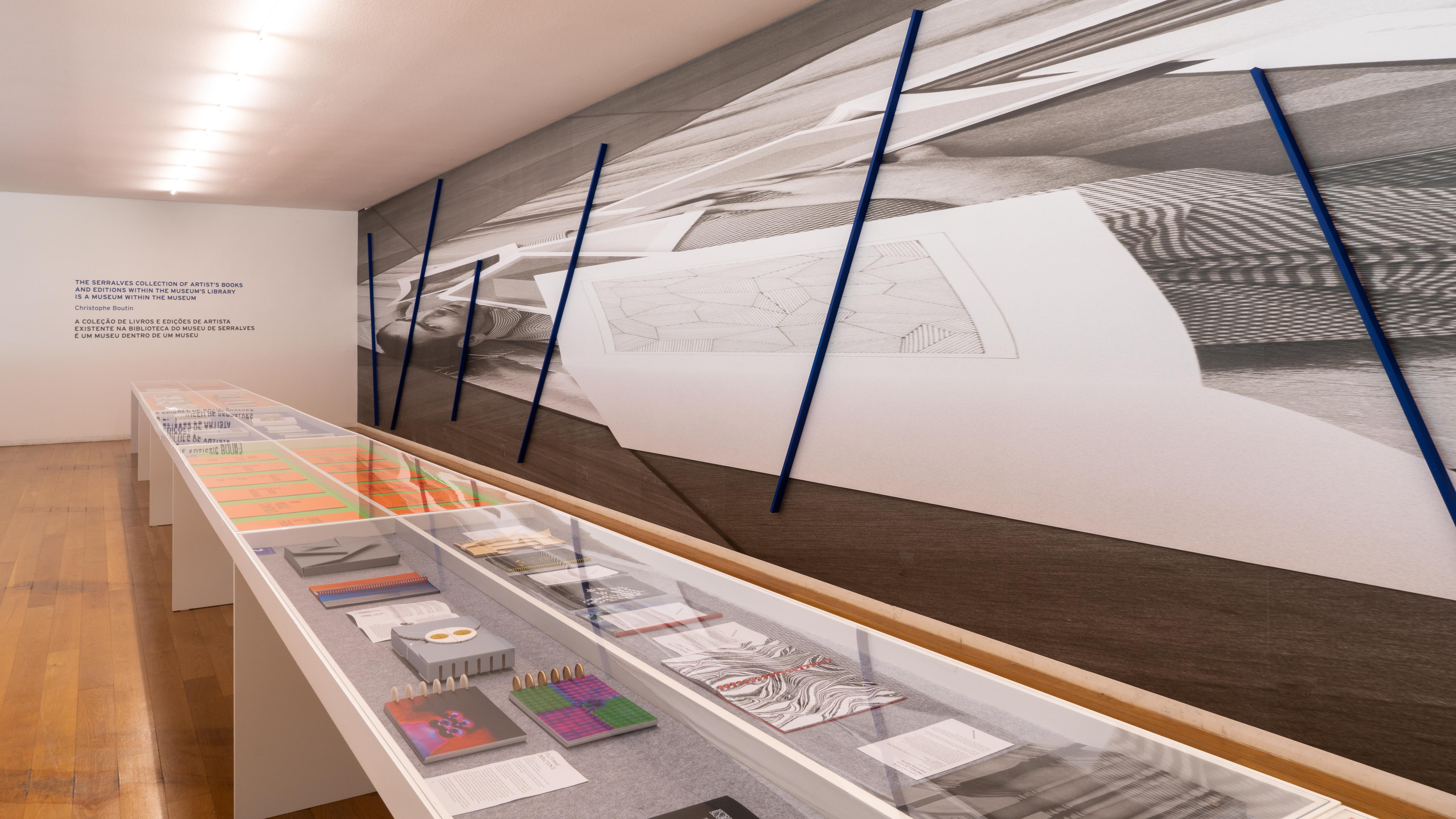
Jonathan Monk has created “Jonathan Monk after Jerry MacMillan after Ed Ruscha after Louise Lawler (with Sol LeWitt & Blue Poles)” 2023, a twenty-meter-long wallpaper to adorn the gallery's longest wall. Demonstrating his admiration for the artistic achievements of his predecessors, Monk presents an expanded self-portrait depicting himself lying on the floor of his studio, covered with numerous Sol LeWitt artists' books from his personal collection. This image is a reinterpretation of a photograph taken by Jerry McMillan in 1970, which originally portrayed Ed Ruscha in a similar position, but covered with his own publications. Enhancing the impact of the installation, eight wooden poles painted in vibrant Yves Klein Blue emerge atop the wallpaper, reminiscent of Jackson Pollock's renowned masterpiece, "Blue Poles." It is worth noting that the distortion in Monk's image is a subtle reference to Louise Lawler's series of deformed images, which first debuted in 2011. By combining these sophisticated art references, post-conceptual artist Jonathan Monk has created a compelling new work.
The artists:
TAUBA AUERBACH and Diagonal Press
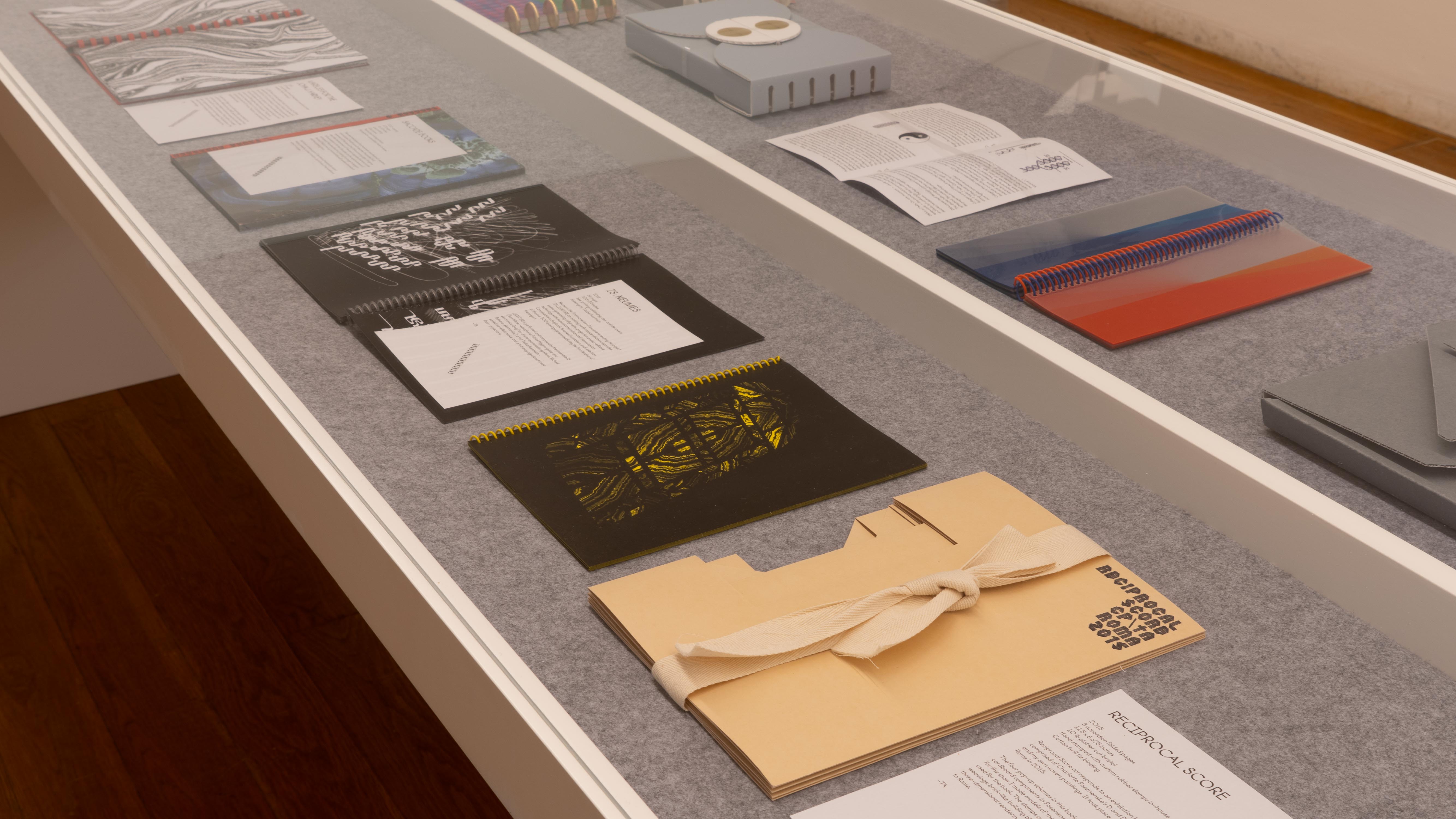
Diagonal Press is an independent publishing imprint founded and managed by Tauba Auerbach herself. The press aims to create and distribute the artist’s own books and printed matter pushing the boundaries of conventional publishing. Diagonal Press acts as a platform for Auerbach to experiment with different bookmaking techniques, materials, and formats. The books published by Diagonal Press often incorporate unique printing methods, intriguing layouts, and unconventional bindings.
These books showcase Auerbach’s meticulous attention to detail and the thoughtful interplay between materiality and content, further enriching her artistic narrative.
LIZ DESCHESNES
Liz Deschenes (b. 1966) is an artist and photographer, whose work is engaged with expanding the terms of photography and the conditions of display.
For REGISTRATION, Deschenes first project with Three Star Books, the artist decided to look back at her seminal series of moirés* from 2007.
Twenty four new moirés, specially created for this occasion, are printed on a combination of Keaykolour and Curious Translucent Clear paper, the plates are bound with a Cerlox Binding — the same used on Man Ray’s book: “Photographs 1920 - 1934” (Hartford, James Thrall Soby, 1934). The bound volume is protected with a cardboard and fabric hot foil stamped cover.
REGISTRATION by Deschenes perfectly exemplifies the artist's rigorous method in conceiving new works. An intense exchange of text messages, emails, videos and express courier packages between the artist and Three Star Books were crucial in the production of this definitive and delicate book. As the late and revered master of The New Topographic Movement of the late 1970’s Lewis Baltz once told us: “It is interesting to observe how conceptual artists are precise and concise when it comes to producing any type of physical object, and how their attention to production details is of the utmost importance.”
*Some words about Deschenes’ moiré series from the press release of:
LIZ DESCHENES - Registration - APRIL 6 — MAY 20, 2007 @ Miguel Abreu Gallery, New York:
Liz Deschenes relies on traditional photographic principles. In her recent Moiré series, she begins with a sheet of perforated paper placed against a well-lit window. She opens the shutter, closes it, and registers the silhouetted pattern of the paper on an 8x10 inch black and white negative. However, Deschenes does not print this singular photographic event. Rather, duplicating the negative, she superimposes two copies in the enlarger distorting the original image. Printed in color, the final image does not reveal the perforated paper, but, through the artist’s mis-registration of the two negatives, a unique moiréd formation.
MAURIZIO CATTELAN
Books are key in Maurizio Cattelan's artistic practice, serving as a platform for his provocative and often humorous conceptual art, confronting societal norms, utilizing satire and irony to critique the art world and broader cultural contexts. The artist has also authored numerous artist books as documentation for his exhibitions and installations.
Through his collaboration with Three Star Books, Cattelan developed a technique that involved creating a conventional design layout, which was then transposed into watercolors along with the accompanying texts. These watercolor “paintings” were subsequently replicated as facsimiles, effectively metamorphosing the photographs of Cattelan's original works into unique and self-contained artistic creations. These transformed pieces can now be appreciated as distinct works of art in their own right.
JONATHAN MONK
Books and ephemera play a significant role in the artistic practice of Jonathan Monk, serving as essential components of his conceptual and process-based approach.
The artist explores the idea of appropriation and homage by reworking existing artists’ materials such as postcards, flyers, tickets, and other transitory materials that he collects and repurposes, infusing them with new artistic significance. With this approach, like in the show’s wallpaper, books are incorporated and transformed as artistic objects, subjects, or mediums. Through these interventions, Monk questions authorship, originality, and the role of the artist.
Ephemera additionally serves Monk as a trace for shows, performances, events or interventions, documenting and contextualizing his actions and ideas.
RIRKRIT TIRAVANIJA
Rirkrit Tiravanija is an artist of many skills: he cooks, paints, sculpts, makes movies, builds houses, curates, teaches. He is also an artist of words. So many words that he needed his very own “corporate” font, the TIRAVANIJA ONE*, designed in 2007 by Chris Rehberger from Berlin’s design studio “Double Standards”. The font has since been used on all of Tiravanija works that involve text, such as paintings, prints, ping pong tables and even marble sculptures…
For Three Star Books, Tiravanija had the idea to make a book of stencil, the slogans die-cut on a hefty orange “Lustro” card, a specialty paper produced in France. In Thai culture the color orange or saffron represents simplicity and detachment from materiality, the perfect choice for this book of spiritual aphorisms.
In the style of a Bauhaus research book with its plain and functional design, ONCE UPON A TIME is composed of six slogans in English, followed by their French translations, arranged by the artist so as to create a “poem” to be read from page one to twelve.
The slogans composing this volume were selected from a series of works exhibited at Galerie Chantal Crousel, Paris, in 2018. Most of the individual phrases —though sometimes misquoted as Rirkrit Tiravanija is happy to admit— can be easily tracked back to John Giorno’s poems, video games, high literature, TV shows or the artist’s everyday‘s wandering and procrastination…
Thanks to the binding rings, the die cut individual stencils are usable and can be sprayed to easily diffuse Tiravanija’s « activist » poetry.
*”When Rirkrit Tiravanija asked us in 2007 to design a typeface based on a stencil he brought back from Venice it didn’t take us too long to agree on it, since we were supposed to design his poster for the Guggenheim show THEANYSPACEWHATEVER, and his documentary CHEW THE FAT that was part of it. What took us by surprise and a little while longer than we thought at first was the optimization process, since our goal was to keep the font’s stencil-like appearance and at the same time to even out the more or less too obviously wrong bits of it. As there were minimal corrections necessary in stroke and letter widths, curves and corners. The typeface TIRAVANIJA ONE was then used by us to design the poster and film titles of CHEW THE FAT and is since then an inherent part of Rirkrit’s repertoire in paintings and prints.”
Chris Rehberger
(from the text that accompanied the presentation of the TIRAVANIJA ONE type specimen at BOOK MACHINE, Centre Pompidou, curated by Christophe Boutin and Mélanie Scarciglia - 20 February - 11 March 2013 @ Le Nouveau festival du Centre Pompidou)
SLAVS AND TATARS
Printed material plays a pivotal role in the artistic practice of Slavs and Tatars, an interdisciplinary collective known for merging research, visual art, and publishing. They employ a traditional approach to utilize printed matter as a medium for spreading their ideas, engaging with audiences, and fostering dialogues on cultural and geopolitical themes.
The collective's publications seamlessly blend visual elements, texts, and historical allusions, presenting alternative perspectives on language, identity, religion, and political power dynamics. These publications serve as tangible and accessible manifestations of their conceptual inquiries, providing a framework for comprehending their extensive body of work. The layout of their productions, characterized by bold and vibrant designs, captures the essence of the cultures they encounter, enriching their creative vision with references and imagery that ignite their artistic creations.
ONESTAR PRESS
Christophe Boutin and Mélanie Scarciglia established onestar press in 2000 and terminated it in 2019. The publishing house was founded by the duo as an independent platform for artists to create and distribute works in book form. onestar press has since gained recognition for its innovative and diverse range of artist books, multiples, and editions. The focus on affordable and accessible editions allows a wider audience to engage with and collect the works of contemporary artists.
Even as digital media gained an increasing popularity in recent years, print still holds significance for many artists. It's within this perspective that the Serralves Library is presenting works by Tauba Auerbach, Liz Deschenes, Maurizio Cattelan, Jonathan Monk, Rirkrit Tiravanija and Slavs and Tatars. The exhibition additionally features a curated selection of books by the French publisher onestar press, highlighting the value of print as an important medium for many artists as they explore and expand their practices.
The variety of forms on view within the books, ephemera, and posters by the artists presented at Print Matters, Yeah! reflect the diversity of our contemporary art world. No art movement dominates, as the featured artists stand out as strong individuals, each forging their own distinct path asserting themselves as unique entities with diverse styles. Nevertheless, they all maintain a connection to the artists of the past, often referencing and drawing inspiration from the heritage of art history.
The title of the exhibition Print Matters, Yeah! plays on the name of PRINTED MATTER, Inc., as a tribute to the famous New York bookstore specializing in artist’s books. Founded in 1976 by Sol Lewitt and Lucy Lippard with a group of artists and critics who felt the need for a dedicated bookstore to distribute their publications, Printed Matter has since served as a dedicated platform for the distribution, exhibition, and appreciation of publications created by artists.
Installation
Jonathan Monk has created “Jonathan Monk after Jerry MacMillan after Ed Ruscha after Louise Lawler (with Sol LeWitt & Blue Poles)” 2023, a twenty-meter-long wallpaper to adorn the gallery's longest wall. Demonstrating his admiration for the artistic achievements of his predecessors, Monk presents an expanded self-portrait depicting himself lying on the floor of his studio, covered with numerous Sol LeWitt artists' books from his personal collection. This image is a reinterpretation of a photograph taken by Jerry McMillan in 1970, which originally portrayed Ed Ruscha in a similar position, but covered with his own publications. Enhancing the impact of the installation, eight wooden poles painted in vibrant Yves Klein Blue emerge atop the wallpaper, reminiscent of Jackson Pollock's renowned masterpiece, "Blue Poles." It is worth noting that the distortion in Monk's image is a subtle reference to Louise Lawler's series of deformed images, which first debuted in 2011. By combining these sophisticated art references, post-conceptual artist Jonathan Monk has created a compelling new work.
The artists:
TAUBA AUERBACH and Diagonal Press
Diagonal Press is an independent publishing imprint founded and managed by Tauba Auerbach herself. The press aims to create and distribute the artist’s own books and printed matter pushing the boundaries of conventional publishing. Diagonal Press acts as a platform for Auerbach to experiment with different bookmaking techniques, materials, and formats. The books published by Diagonal Press often incorporate unique printing methods, intriguing layouts, and unconventional bindings.
These books showcase Auerbach’s meticulous attention to detail and the thoughtful interplay between materiality and content, further enriching her artistic narrative.
LIZ DESCHESNES
Liz Deschenes (b. 1966) is an artist and photographer, whose work is engaged with expanding the terms of photography and the conditions of display.
For REGISTRATION, Deschenes first project with Three Star Books, the artist decided to look back at her seminal series of moirés* from 2007.
Twenty four new moirés, specially created for this occasion, are printed on a combination of Keaykolour and Curious Translucent Clear paper, the plates are bound with a Cerlox Binding — the same used on Man Ray’s book: “Photographs 1920 - 1934” (Hartford, James Thrall Soby, 1934). The bound volume is protected with a cardboard and fabric hot foil stamped cover.
REGISTRATION by Deschenes perfectly exemplifies the artist's rigorous method in conceiving new works. An intense exchange of text messages, emails, videos and express courier packages between the artist and Three Star Books were crucial in the production of this definitive and delicate book. As the late and revered master of The New Topographic Movement of the late 1970’s Lewis Baltz once told us: “It is interesting to observe how conceptual artists are precise and concise when it comes to producing any type of physical object, and how their attention to production details is of the utmost importance.”
*Some words about Deschenes’ moiré series from the press release of:
LIZ DESCHENES - Registration - APRIL 6 — MAY 20, 2007 @ Miguel Abreu Gallery, New York:
Liz Deschenes relies on traditional photographic principles. In her recent Moiré series, she begins with a sheet of perforated paper placed against a well-lit window. She opens the shutter, closes it, and registers the silhouetted pattern of the paper on an 8x10 inch black and white negative. However, Deschenes does not print this singular photographic event. Rather, duplicating the negative, she superimposes two copies in the enlarger distorting the original image. Printed in color, the final image does not reveal the perforated paper, but, through the artist’s mis-registration of the two negatives, a unique moiréd formation.
MAURIZIO CATTELAN
Books are key in Maurizio Cattelan's artistic practice, serving as a platform for his provocative and often humorous conceptual art, confronting societal norms, utilizing satire and irony to critique the art world and broader cultural contexts. The artist has also authored numerous artist books as documentation for his exhibitions and installations.
Through his collaboration with Three Star Books, Cattelan developed a technique that involved creating a conventional design layout, which was then transposed into watercolors along with the accompanying texts. These watercolor “paintings” were subsequently replicated as facsimiles, effectively metamorphosing the photographs of Cattelan's original works into unique and self-contained artistic creations. These transformed pieces can now be appreciated as distinct works of art in their own right.
JONATHAN MONK
Books and ephemera play a significant role in the artistic practice of Jonathan Monk, serving as essential components of his conceptual and process-based approach.
The artist explores the idea of appropriation and homage by reworking existing artists’ materials such as postcards, flyers, tickets, and other transitory materials that he collects and repurposes, infusing them with new artistic significance. With this approach, like in the show’s wallpaper, books are incorporated and transformed as artistic objects, subjects, or mediums. Through these interventions, Monk questions authorship, originality, and the role of the artist.
Ephemera additionally serves Monk as a trace for shows, performances, events or interventions, documenting and contextualizing his actions and ideas.
RIRKRIT TIRAVANIJA
Rirkrit Tiravanija is an artist of many skills: he cooks, paints, sculpts, makes movies, builds houses, curates, teaches. He is also an artist of words. So many words that he needed his very own “corporate” font, the TIRAVANIJA ONE*, designed in 2007 by Chris Rehberger from Berlin’s design studio “Double Standards”. The font has since been used on all of Tiravanija works that involve text, such as paintings, prints, ping pong tables and even marble sculptures…
For Three Star Books, Tiravanija had the idea to make a book of stencil, the slogans die-cut on a hefty orange “Lustro” card, a specialty paper produced in France. In Thai culture the color orange or saffron represents simplicity and detachment from materiality, the perfect choice for this book of spiritual aphorisms.
In the style of a Bauhaus research book with its plain and functional design, ONCE UPON A TIME is composed of six slogans in English, followed by their French translations, arranged by the artist so as to create a “poem” to be read from page one to twelve.
The slogans composing this volume were selected from a series of works exhibited at Galerie Chantal Crousel, Paris, in 2018. Most of the individual phrases —though sometimes misquoted as Rirkrit Tiravanija is happy to admit— can be easily tracked back to John Giorno’s poems, video games, high literature, TV shows or the artist’s everyday‘s wandering and procrastination…
Thanks to the binding rings, the die cut individual stencils are usable and can be sprayed to easily diffuse Tiravanija’s « activist » poetry.
*”When Rirkrit Tiravanija asked us in 2007 to design a typeface based on a stencil he brought back from Venice it didn’t take us too long to agree on it, since we were supposed to design his poster for the Guggenheim show THEANYSPACEWHATEVER, and his documentary CHEW THE FAT that was part of it. What took us by surprise and a little while longer than we thought at first was the optimization process, since our goal was to keep the font’s stencil-like appearance and at the same time to even out the more or less too obviously wrong bits of it. As there were minimal corrections necessary in stroke and letter widths, curves and corners. The typeface TIRAVANIJA ONE was then used by us to design the poster and film titles of CHEW THE FAT and is since then an inherent part of Rirkrit’s repertoire in paintings and prints.”
Chris Rehberger
(from the text that accompanied the presentation of the TIRAVANIJA ONE type specimen at BOOK MACHINE, Centre Pompidou, curated by Christophe Boutin and Mélanie Scarciglia - 20 February - 11 March 2013 @ Le Nouveau festival du Centre Pompidou)
SLAVS AND TATARS
Printed material plays a pivotal role in the artistic practice of Slavs and Tatars, an interdisciplinary collective known for merging research, visual art, and publishing. They employ a traditional approach to utilize printed matter as a medium for spreading their ideas, engaging with audiences, and fostering dialogues on cultural and geopolitical themes.
The collective's publications seamlessly blend visual elements, texts, and historical allusions, presenting alternative perspectives on language, identity, religion, and political power dynamics. These publications serve as tangible and accessible manifestations of their conceptual inquiries, providing a framework for comprehending their extensive body of work. The layout of their productions, characterized by bold and vibrant designs, captures the essence of the cultures they encounter, enriching their creative vision with references and imagery that ignite their artistic creations.
ONESTAR PRESS
Christophe Boutin and Mélanie Scarciglia established onestar press in 2000 and terminated it in 2019. The publishing house was founded by the duo as an independent platform for artists to create and distribute works in book form. onestar press has since gained recognition for its innovative and diverse range of artist books, multiples, and editions. The focus on affordable and accessible editions allows a wider audience to engage with and collect the works of contemporary artists.
© 2024 Three Star Books, All Rights Reserved